Tongue & Cheek
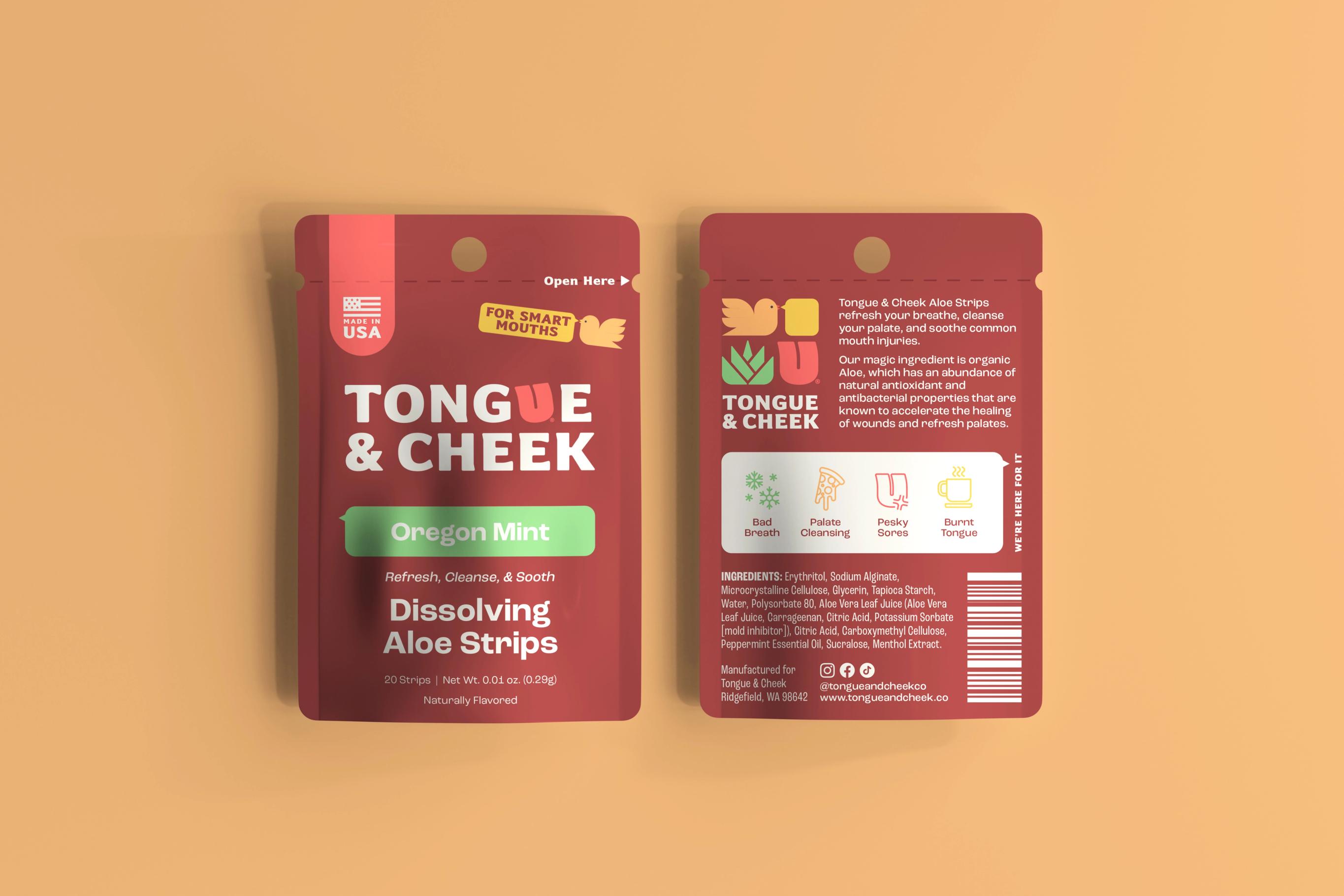
Is it ever ok to lean into puns as part of a product brand?
When your client has created healing, aloe based mouth strips and named it Tongue and Cheek, how can you not?
Brand Strategy
Brand Identity
Packaging Design
Challenge
This product is inventive, solution-oriented, and has a great sense of humor. Tongue and Cheek came to us with a developed product: all natural, aloe based mouth strips that heal ailments like magic and taste great while they’re at it. But they needed a brand that lived up to the product in value and flair. They wanted a visual identity that would make a splash in retail and digital spaces and that brought the personality of the product to life.
Solution
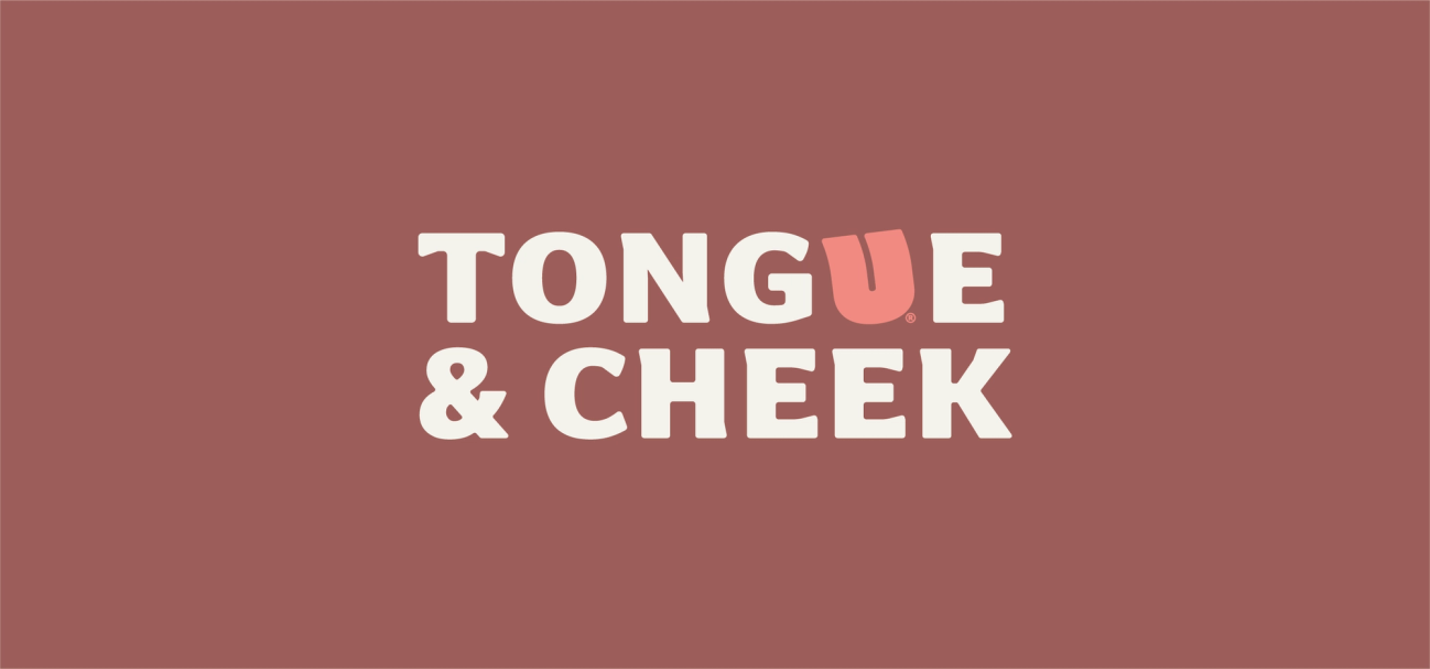
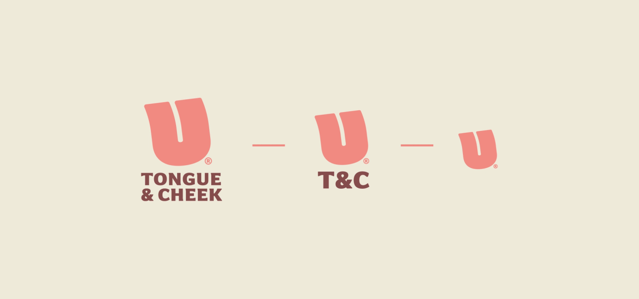
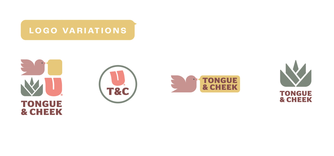
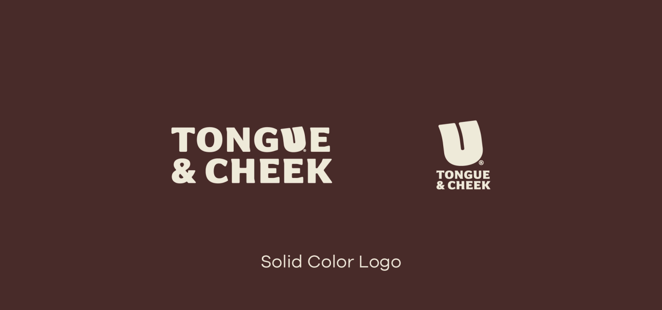
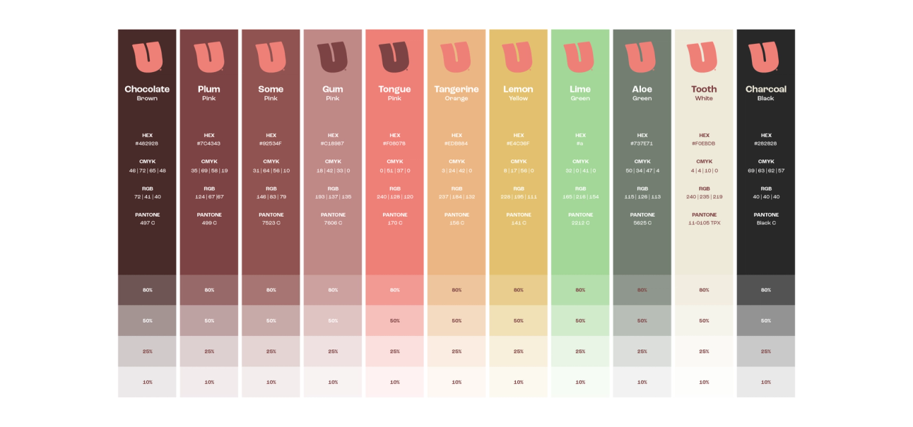
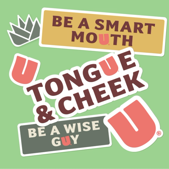
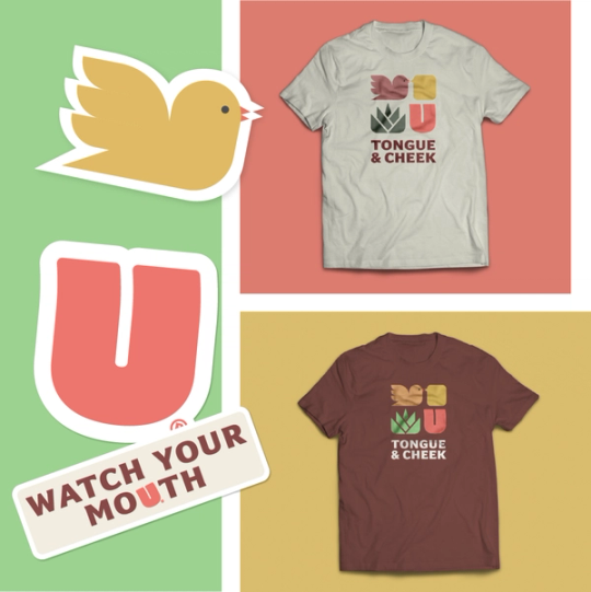
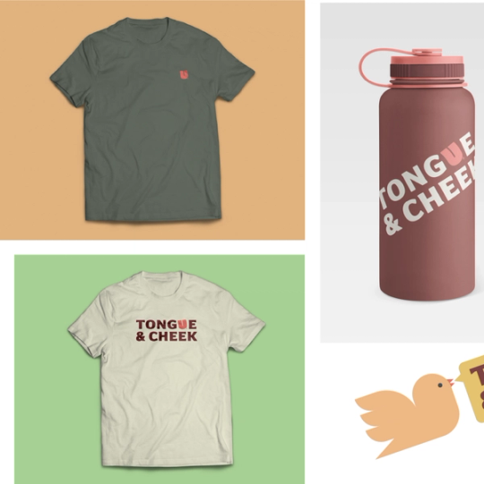
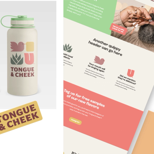
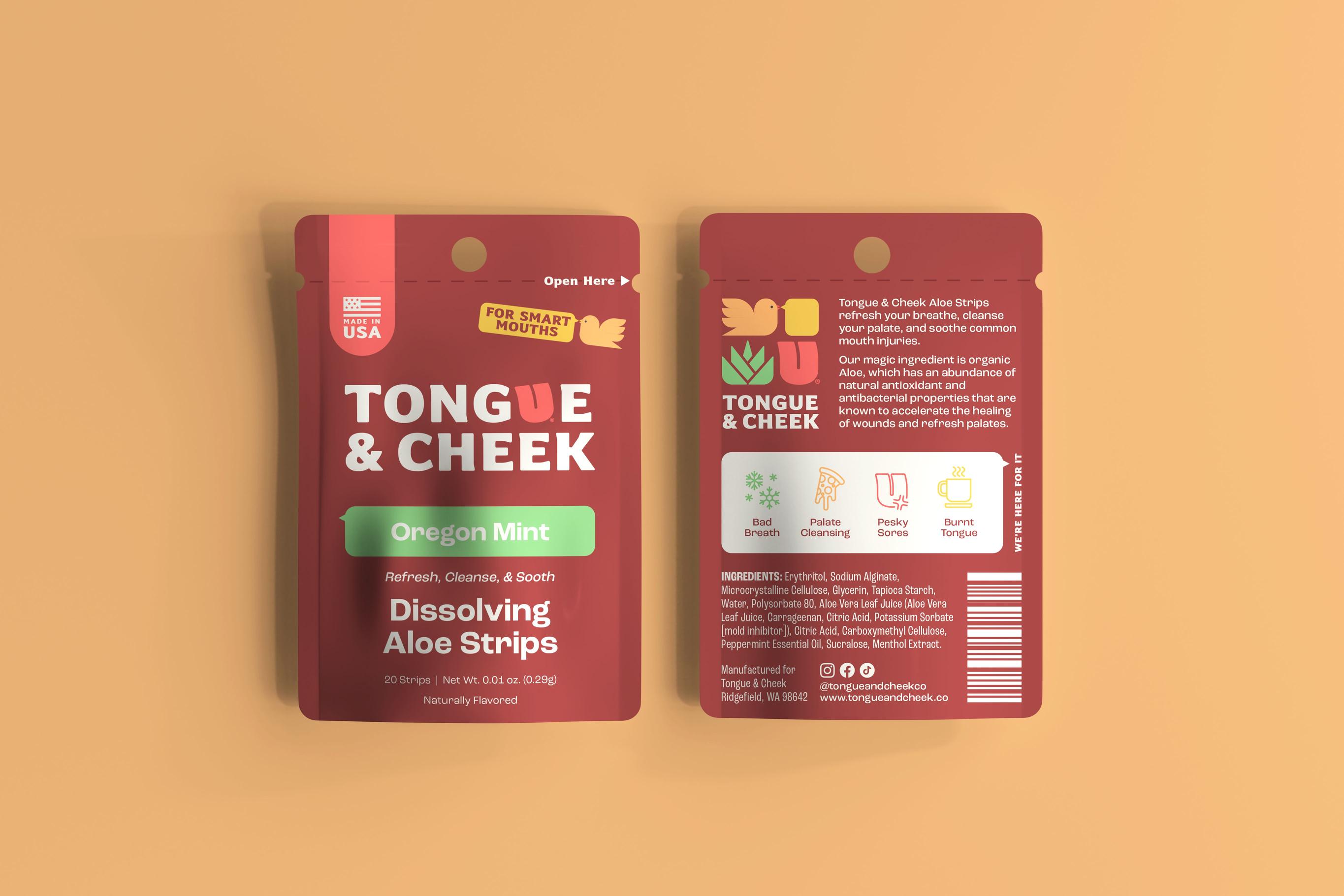
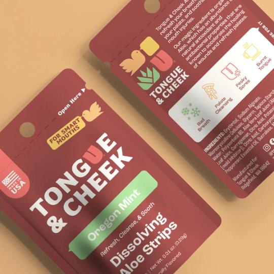
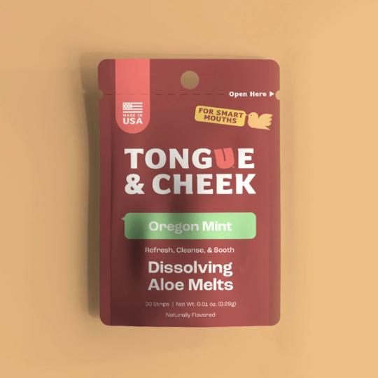
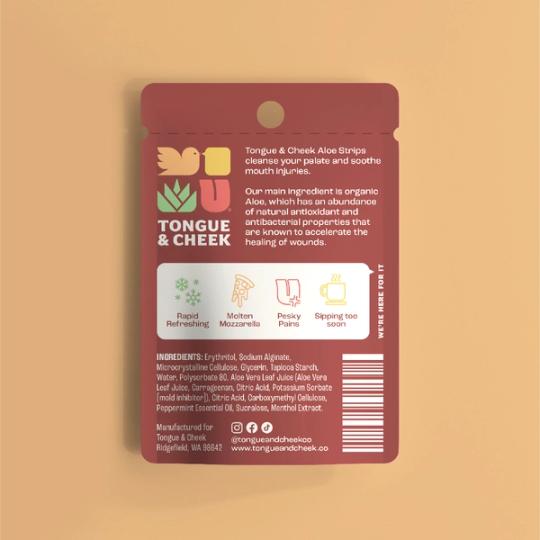
There were so many fun ways to bring this brand to life, it was actually hard to pick just one direction. But like any good creative process, we worked with the client to pull out the best of each idea and fit it all together into one fun, modern, cheeky (couldn’t resist) logo mark. The bright color palette makes it pop on a shelf and communicates the uniqueness of this particular product. Once the brand was established, we applied it to custom packaging, helping the client select the correct die cut for their product size and color needs. In the end, we helped to ensure that Tongue and Cheek was ready to shine online and in store.

About Tongue & Cheek
An oral wellness solution that provides natural healing on-the-go using simple, locally sourced ingredients. The remedy you keep on hand for: bad breath, palate cleansing and pesky mouth pains.
Services
Brand StrategyBrand IdentityPackaging DesignTeam
Mack StrommeCarli RudeKenzie Joner